Final Art in Context discusses how graphic design impacts politics
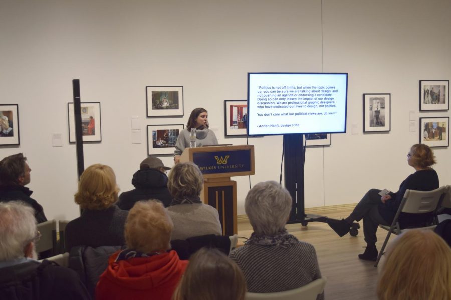
Lisa Reynolds explaining the evolution of presidential campaign poster design.
Lisa Reynolds, assistant professor of digital design and media art (DDMA), delivered a lecture on Nov. 3 titled, “Designing a Presidency: How Graphic Design Influences the Political Narrative.” It was the third and final lecture relating to the “Pete Souza: Two Presidents: One Photographer” exhibit.
Reynolds explained how early campaign communication in the early 1800s was not created or released by presidential campaigns themselves. Specific organizations would create artwork on behalf of the candidate they supported. Most early visual campaigns were done through editorial cartoons, songs or artwork.
“This specific example is amateurish, made by hand from someone in a lower class, who probably has no stake in politics,” she said, pointing to an example of an early Thomas Jefferson poster. “But it’s the first time seeing someone feel so passionately about the country and how it’s being led that they’re compelled to create something.”
This theme of patriotism continues to the present day, with Reynolds saying it is almost a competition to see who can put the most flags, bald eagles, and red, white and blue in their campaigns.
“I thought it was an extremely interesting presentation that I learned a lot from. I enjoyed it very much,” said Sam Meehan, senior DDMA major.
Early official campaign posters were similar in design: symmetrical, polished portraits. While the candidates were different, their portrayals were the exact same.
Teddy Roosevelt’s campaign, however, changed that, with one of his campaign posters being a massive picture of him, staring directly at the viewer. This marked a shift in poster design, with the primary focus now being about voting for a candidate because of the person instead of their ideals.
Other examples included Woodrow Wilson in a religious pose with an American flag backdrop, John F. Kennedy “being handsome” and very aware of his media portrayal, and Jimmy Carter on his farm portraying himself as a man of the people.
“It’s crazy seeing how design for presidential campaigns has changed over the years and the impact it has. Even as a designer it never occurred to me,” said Jessica Morandi, junior DDMA major.
A significant campaign was Ronald Reagan, which took out his face and only used his name on posters. He used television and radio to communicate his message. This was consistent until 2008, where Barack Obama’s campaign was the first campaign that referred to a person as a shape and heavily used social media.
The “O” in his last name was designed as a rising sun with red and white stripes: the dawn of a new day. It was a very versatile logo that was included in words and phrases. The famous Hope poster was a successful example of fan art embraced by the campaign.
The 2016 Donald Trump campaign was notable in being the absence of design. In place of a logo was a slogan: Make America Great Again. Instead of having an identity or sophisticated logos, the campaign allowed and encouraged meme culture on social media. This drove his identity and allowed “normal people” to be active participants in the election process, much like George Washington.
The current exhibit featuring Pete Souza’s photographs will remain open until Dec. 8. The next exhibit will open Jan. 14, featuring contemporary textile art.

Parker Dorsey is a senior communications studies major with a concentration in strategic communications. Parker began as a staff writer for the opinion...